Table of Contents
ToggleKitchen cabinet color isn’t just about aesthetics, it’s a long-term commitment that sets the tone for the busiest room in most homes. Whether you’re planning a full remodel or contemplating a cabinet refresh, knowing what’s current helps avoid dated choices that’ll make the space feel stale in five years. The good news? 2026’s trending cabinet colors range from safe classics to bold statement-makers, giving homeowners plenty of flexibility. This guide breaks down what’s actually showing up in kitchens right now, why certain colors work better in specific scenarios, and how to choose a finish that’ll hold up both functionally and visually.
Key Takeaways
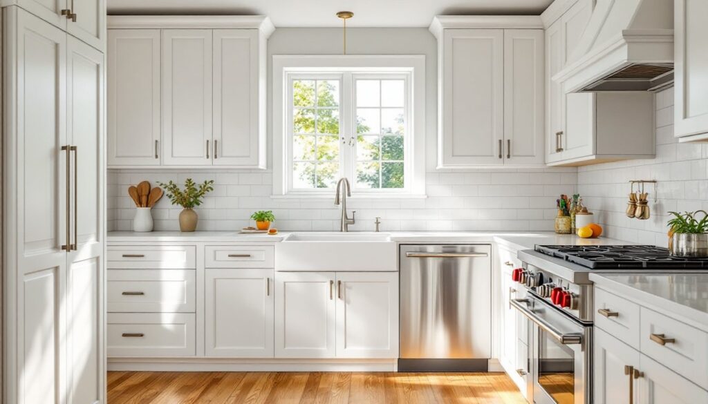
- Warm whites, creams, and soft undertones are replacing stark whites as the most popular kitchen cabinet color choice in 2026, offering better durability and a less clinical appearance than pure white.
- Deep greens, navy blues, and rich wood tones are trending bold statement cabinet colors that work best in larger kitchens with abundant natural light and traditional or transitional design styles.
- Two-tone cabinet combinations using dark lower cabinets with light uppers, or bold island colors paired with neutral perimeter cabinets, add visual interest while maintaining flexibility and cost-effectiveness in kitchen remodels.
- Kitchen cabinet color selection should be guided by space size, natural lighting conditions, overall home style, and long-term plans—lighter colors for small spaces and bold colors for larger, well-lit kitchens that justify the design commitment.
- Dark cabinet colors require more frequent maintenance to hide fingerprints and water spots, while matte or satin finishes offer a better balance between aesthetics and practicality than glossy sheens.
- Testing paint samples on large boards at different times of day is essential before committing to a kitchen cabinet color, as natural and artificial lighting dramatically affects how colors appear throughout the day.
Timeless White Cabinets: Why They’re Still the Most Popular Choice
White cabinets remain the dominant choice for a reason: they maximize light reflection, make small kitchens feel larger, and pair with virtually any countertop or backsplash material. The shift in 2026 isn’t away from white, but toward warmer white tones, soft creams, alabaster, and off-whites with subtle yellow or gray undertones instead of stark, sterile whites.
Shaker-style cabinets in warm white continue to dominate new construction and remodels, particularly in paint grades like Benjamin Moore’s Simply White or Sherwin-Williams’ Alabaster. These finishes hide minor wear better than pure whites and don’t cast the cold, clinical vibe that cooler whites can create under LED lighting.
From a practical standpoint, white cabinets show dust and fingerprints less than darker colors, and they’re easier to touch up over time. If a door gets damaged, matching white paint is straightforward compared to custom-mixed colors. That said, white shows kitchen grease buildup more readily than darker tones, so plan on wiping down doors near the range monthly if you cook frequently.
One consideration: white works best in kitchens with adequate natural light or quality task lighting. In poorly lit spaces, white cabinets can look dingy or flat. Pair them with under-cabinet LED strips (2700K-3000K color temperature) to maintain warmth and visibility.
Rich, Earthy Tones: The Rise of Warm Neutrals and Natural Woods
After a decade of cool grays dominating kitchens, the pendulum’s swinging hard toward warm neutrals, think taupe, greige, soft tan, and muted terracotta. These colors add depth without overwhelming the space, and they pair beautifully with natural materials like butcher block countertops, brass hardware, and stone backsplashes.
Natural wood cabinets are also seeing a resurgence, particularly quarter-sawn white oak with a clear or light stain that highlights the grain. Unlike the honey oak of the 1990s, today’s wood finishes lean cooler and lighter, often with a matte or satin topcoat instead of glossy polyurethane. White oak’s tight grain resists warping better than red oak and takes stain more evenly, crucial if you’re mixing stained lowers with painted uppers.
Walnut is another strong contender, especially for modern or mid-century kitchen styles. Its chocolate-brown tones ground a space and hide wear exceptionally well, though it comes at a premium, expect walnut cabinets to run 30-50% more than oak or maple in similar configurations.
If you’re considering stained wood, test samples in your actual kitchen lighting before committing. Natural lighting conditions dramatically affect how wood tones read throughout the day, and what looks warm and inviting at noon can appear muddy under evening task lights. Also, be mindful that wood cabinets require periodic reconditioning, plan to clean and reapply a topcoat every 3-5 years depending on use and exposure to sunlight.
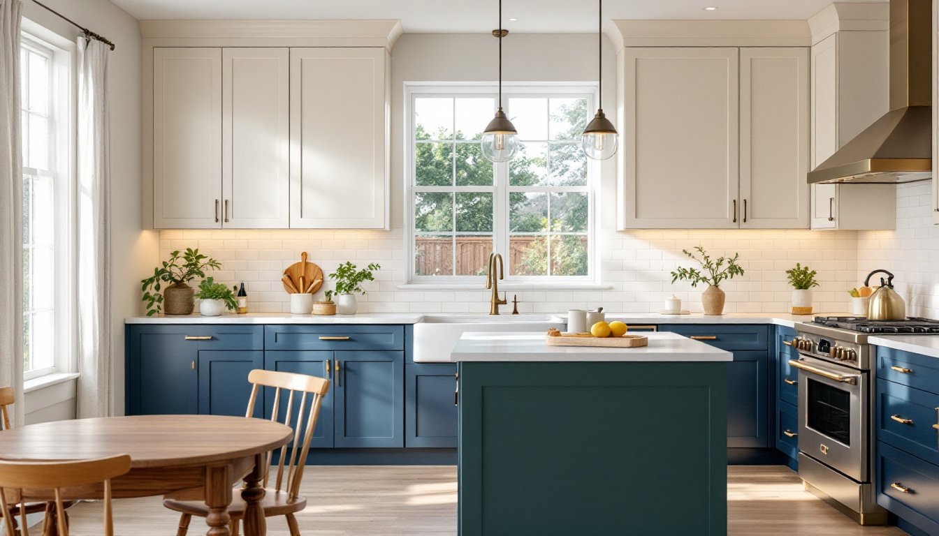
Deep Greens and Navy Blues: Bold Colors Making a Statement
Deep, saturated cabinet colors are no longer relegated to accent islands. Full kitchens in hunter green, forest green, and navy blue are trending heavily in 2026, particularly in homes with traditional or transitional design aesthetics. These colors create a moody, sophisticated backdrop that works especially well in kitchens with ample square footage and natural light.
Navy blue cabinets offer a classic, almost nautical feel without reading as juvenile. They pair exceptionally well with brass or aged bronze hardware, white marble or quartz countertops, and subway tile backsplashes. Sherwin-Williams’ Naval and Benjamin Moore’s Hale Navy are both popular spec choices for builders and remodelers.
Hunter green and sage green cabinets deliver a grounded, organic feel that complements farmhouse and cottage styles. Darker greens work best on lower cabinets with lighter uppers or open shelving to avoid a cave-like effect. In smaller kitchens (under 150 square feet), limit deep colors to an island or a single run of base cabinets to maintain visual breathing room.
One practical note: dark cabinets show every smudge, fingerprint, and water spot. If you have young kids or you’re not diligent about wiping down surfaces, these finishes will frustrate you. Matte or satin sheens hide imperfections better than high-gloss, though gloss is easier to clean. Also, darker paints can fade or shift in color with prolonged sun exposure, so consider UV-filtering window treatments if your kitchen gets strong afternoon light.
Two-Tone Cabinet Combinations for Added Depth and Interest
Two-tone kitchens, where upper and lower cabinets are painted different colors, continue to gain traction as homeowners look for ways to add visual interest without full-scale pattern or texture changes. The most common approach is dark lowers with light uppers, which grounds the space while keeping it open and airy.
Classic pairings include navy or charcoal base cabinets with white or cream uppers, or natural wood lowers with painted uppers. This strategy also allows you to introduce a bolder color in smaller doses: if you’re nervous about committing to deep green or black, use it on the island and lower perimeter cabinets while keeping uppers neutral.
Another growing trend: contrasting the island entirely. A bold island in a saturated color, emerald green, burnt orange, or even black, can serve as the kitchen’s focal point while the perimeter stays neutral. This works particularly well in open-concept layouts where the island is visible from adjacent living spaces.
From a practical standpoint, two-tone cabinets add cost and complexity. You’re dealing with two paint colors, which means more masking, more coats, and potentially more touch-up down the line. If you’re DIYing, expect the job to take 25-30% longer than a single-color kitchen. Hiring out? Budget an extra $500-$1,200 depending on kitchen size and whether you’re using different hardware finishes to complement each color.
One design tip: maintain a consistent door style across both colors. Mixing Shaker lowers with flat-panel uppers can look disjointed unless you’re very deliberate about the overall design language.
How to Choose the Right Cabinet Color for Your Kitchen
Choosing a cabinet color isn’t just about what’s trending, it’s about how the space functions, how much light it gets, and how long you plan to stay in the home. Here’s how to narrow it down.
Consider Your Kitchen Size and Natural Light
Small kitchens (under 120 square feet) benefit from lighter cabinet colors that reflect light and make the space feel larger. White, cream, light gray, and pale wood tones are all safe bets. If you want color, save it for an island or a single accent wall of cabinets.
Kitchens with limited natural light, north-facing windows, small windows, or windows blocked by trees or neighboring structures, should lean toward warm whites, light woods, or warm neutrals. Cool grays and stark whites can feel dreary in low-light conditions. Add under-cabinet lighting (LED strips delivering at least 300 lumens per linear foot) to compensate.
Larger kitchens with abundant natural light can handle darker, bolder colors without feeling cramped. If you’ve got south- or west-facing windows and 200+ square feet, deep blues, greens, or even black cabinets are viable. Just remember that color perception shifts dramatically with changing daylight, so test paint samples on large boards and observe them at different times of day before committing.
Match Your Cabinets to Your Overall Home Style
Your cabinet color should feel cohesive with the rest of your home’s design language. A sleek, modern home with clean lines and minimal trim calls for flat-panel cabinets in neutrals, bold monochromes, or natural wood with minimal grain. Traditional homes with crown molding, wainscoting, and classic trim details pair best with Shaker or raised-panel cabinets in whites, creams, or rich wood tones.
Farmhouse and cottage styles can pull off softer colors, sage green, dusty blue, or buttery yellow, especially when paired with apron-front sinks, open shelving, and vintage-inspired hardware. Mid-century and transitional styles benefit from walnut, teak, or two-tone combinations that bridge traditional and contemporary.
Also consider your countertops and backsplash. If you’re keeping existing counters, your cabinet color needs to work with what’s already there. Busy granite or patterned tile backsplashes call for simpler cabinet colors: if your counters and backsplash are neutral, you’ve got more freedom to go bold with cabinets.
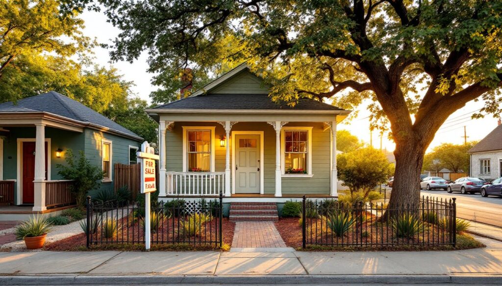
Finally, think resale. If you’re planning to sell within 5 years, stick to neutral, broadly appealing colors, whites, creams, light grays, and natural woods. Bold colors can be polarizing and may limit your buyer pool. If you’re staying long-term, choose what you’ll enjoy living with daily. Kitchen remodels rarely recoup 100% of their cost at resale anyway, so prioritize your own preferences over hypothetical future buyers.