Table of Contents
ToggleChoosing the right paint color for a home theater isn’t just about aesthetics, it directly affects picture quality, eye strain, and the overall immersive experience. While most homeowners focus on screen size and sound systems, the walls surrounding that setup play a critical role in how light behaves in the space. Reflective surfaces bounce light back onto the screen, washing out contrast and dulling colors. Dark, matte finishes absorb stray light and keep the focus where it belongs: on the image. This guide walks through the best colors, finishes, and application tips to get professional-level results without hiring out.
Key Takeaways
- Home theater paint colors directly impact picture quality, eye strain, and the viewing experience by controlling how light reflects off walls and ceilings.
- Dark, matte finishes in charcoal, slate, deep brown, or navy blue are ideal for home theaters because they absorb ambient light and preserve image contrast instead of washing it out.
- Paint finish matters as much as color—use flat or eggshell finishes to minimize glare, and avoid satin, semi-gloss, or gloss finishes that create reflective hotspots.
- Always paint your ceiling the same dark color as the walls to eliminate light halos and create a cohesive, light-absorbing environment around the viewing area.
- Proper application with primer, two coats minimum, and high-quality tools ensures even coverage and true color depth that maximizes light absorption and theater performance.
Why Paint Color Matters in Your Home Theater
Paint color in a home theater serves a functional purpose, not just a decorative one. Light reflects off walls, ceilings, and even floors. In a bright or neutral room, that reflected light bounces back onto the screen, reducing contrast and making blacks look gray. Dark colors absorb ambient light instead of reflecting it, which preserves image depth and color accuracy.
Eye fatigue is another factor. When the wall behind or around a screen is significantly brighter than the screen itself, the eye constantly adjusts between the two brightness levels. Over the course of a two-hour movie, that strain adds up. A dark, uniform wall minimizes that contrast gap and keeps the viewer’s focus on the content.
This is why commercial theaters use dark walls and ceilings. The same principle applies at home, whether the setup is a dedicated theater room or a multipurpose basement. The right paint choice sets the foundation for everything else, the projector, the screen, and the seating, to perform as intended.
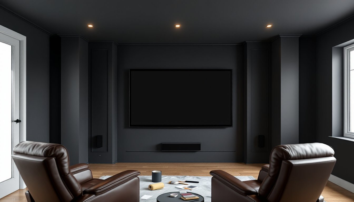
Homeowners often overlook the ceiling in a theater space. If the ceiling is white or light-colored, it will reflect light from the projector or TV, creating a halo effect that degrades the image. Painting the ceiling the same dark color as the walls eliminates that issue and creates a cohesive, light-absorbing envelope around the viewing area.
Best Paint Colors for Home Theaters
Selecting a specific color depends on the room’s use, lighting conditions, and personal preference. But, certain color families consistently deliver better performance in theater environments. The key is choosing hues that are dark enough to absorb light but not so stark that they feel oppressive or cold.
Dark Neutrals: Charcoal, Slate, and Deep Gray
Charcoal and slate gray are go-to choices for home theaters. These colors provide excellent light absorption without the starkness of pure black. Charcoal sits in the range of LRV (Light Reflectance Value) 5–10, meaning it reflects very little light back into the room. Slate tones with subtle blue or green undertones add a bit of dimension without compromising performance.
Dark grays work well in multipurpose spaces where the room isn’t exclusively used for viewing. They’re neutral enough to pair with varied furniture and decor but dark enough to enhance picture quality when the lights go down. For DIYers working with a projector setup, charcoal walls paired with a high-quality media room design help reduce reflections and improve contrast.
When selecting a gray, avoid anything with a strong blue or purple undertone unless that’s intentional. Some grays shift color dramatically under different lighting, especially LED bulbs. Test samples on all four walls and view them at different times of day before committing to a full gallon.
Rich Browns and Warm Earth Tones
Deep browns, espresso, and chocolate tones create a warmer atmosphere than grays while still absorbing light effectively. These colors work particularly well in rooms with wood trim, leather seating, or warmer decor palettes. Browns with red or orange undertones can add a cozy, inviting feel without sacrificing the functional benefits of a dark wall.
One advantage of brown is that it tends to feel less cave-like than black or charcoal, which can be a concern in smaller rooms or basements with limited natural light. If the theater space doubles as a game room or hangout area, a warm brown keeps the room from feeling too utilitarian.
LRV for theater-appropriate browns should be under 15. Anything lighter starts to reflect too much ambient light. Test swatches in the actual room, especially if there’s recessed lighting or sconces that will be on during non-viewing times. Browns can look drastically different under warm incandescent vs. cool LED lighting.
Navy Blue and Deep Jewel Tones
Navy blue, deep burgundy, and forest green offer personality while maintaining the light-absorbing properties needed for a theater. Navy is particularly popular because it evokes the classic cinema aesthetic without feeling as heavy as black. It pairs well with brass or gold accents, vintage movie posters, and art deco-inspired decor.
Jewel tones like sapphire, emerald, or oxblood can work in rooms where the homeowner wants a more stylized look. These colors still perform well functionally as long as the LRV stays low, generally under 10 for the best results. Deep burgundy adds richness and warmth, while forest green can feel unexpectedly sophisticated when paired with dark wood or metal finishes.
One caution: jewel tones can cast a subtle color tint onto the screen if they’re too saturated or reflective. This is more of a concern with projectors than with TVs. If using a projector, test the color in the room with the projector running to ensure it doesn’t introduce unwanted color shifts. Many design enthusiasts exploring bold paint choices find that deeper, muted versions of jewel tones strike the right balance.
Paint Finishes and Sheen Levels That Reduce Glare
Finish matters as much as color. A dark wall painted in a glossy or semi-gloss finish will reflect light just like a lighter color would. For home theaters, the goal is a finish that absorbs and diffuses light rather than bouncing it back.
Flat (matte) finish is the standard for theater walls. It has zero sheen and absorbs the most light. The downside is that flat paint is harder to clean, scuffs, fingerprints, and smudges are more visible and harder to wipe down. In a dedicated theater room where walls aren’t frequently touched, this isn’t an issue. In a multipurpose room, it’s worth considering.
Eggshell finish is a compromise. It has a very slight sheen, just enough to make it more washable than flat, but still keeps reflections minimal. Eggshell works well in rooms with kids, pets, or high traffic where walls are more likely to need cleaning. The performance difference between flat and eggshell is negligible in most home setups, especially with a TV rather than a projector.
Avoid satin, semi-gloss, or gloss finishes entirely. These create hotspots where light reflects directly back, which is exactly what a theater environment should eliminate. Even in a dark color, a satin finish can produce enough glare to interfere with viewing.
Ceiling paint is typically sold in flat finish, which is ideal for a theater. If repainting the ceiling, use the same color as the walls to create a seamless, light-absorbing environment. Some home renovation projects show creative approaches to extending wall color onto ceilings, which works especially well in dedicated theater spaces.
One final note on application: two coats minimum is essential, especially when going from a light color to a dark one. Dark paints often require a tinted primer to achieve even coverage and true color depth. Skipping primer or applying only one coat will result in streaks, uneven color, and reduced light absorption. Use a high-quality roller with a 3/8-inch nap for smooth walls or a 1/2-inch nap for textured surfaces. Cut in edges with a good angled brush, and work in sections to maintain a wet edge and avoid lap marks.
Conclusion
The right paint color transforms a home theater from a room with a screen into an immersive viewing environment. Dark, matte finishes in charcoal, brown, navy, or jewel tones absorb ambient light, reduce eye strain, and let the picture quality shine. Prep work and finish selection are just as important as color choice, skip the primer or choose the wrong sheen, and performance suffers. With the right approach, a weekend paint job delivers results that rival commercial theaters.